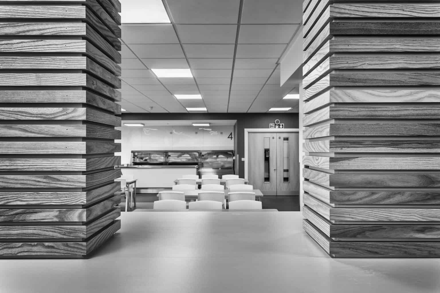
I had forgotten how I produced this black and white image. So I did it again. Well when I say forgot how I produced this image I mean the one I was going to post. I know what I mean!
This was one of my early black and white experiments, so hopefully now with a tried and tested black and white processing regime in Nik Silver Efex Pro this will not take too long.
The image was taken on my Canon 6D using my favourite lens, my Canon 17-40mm F4 L Lens.
The picture was taken using my Manfrotto Tripod, which I feel needs some credit – the poor thing never gets a mention.
The bag my tripod lives in is the Manfrotto MBAG60N. An imaginative name for a bag!
The tripod is the Manfrotto 190 Go! Yes, there is an exclamation mark on the name! I bought this at the Photography Show in March of this year, having tried most of the Manfrotto Range. The head I bought separately, and this is the really important bit to me. It is the MHXPRO-3WG.
I will write about this combination in another post.
There we go – my tripod does not need to feel left out any more….
Back to the shot. Or the black and white version.
I have written about the colour version so after waffling on about gear lets get to the processing in Nik Silver Efex Pro.
Preset
High structure harsh looked good. So did High Structure Smooth.
Full Dynamic Harsh and Full Dynamic Smooth also looked good.
I chose Full Dynamic Harsh, purely because it looked the best.
Moving on……
Filter
The green filter gave the image the most depth so I went with that one. I think we all know what is going to happen next…..
Vignette
Lens Falloff 2
Anything else?
Dynamic Brightness. 53%. Job done.
Hit save, then it is back in Lightroom. Add to the Collection, remove the previous image (which I have already rated as 1 star so I know which image I need to remove) and that is that.
With regard to the actual image, I was drawn to the timber cladding the columns. The smooth white worktop provided a textural contrast, and the two formed a natural frame for the bright green chairs which gave the newly refurbished space a big lump of colour. But not in the black and white version of course…..
I like this image. It has depth and texture to it. This is not easy to achieve under LED ceiling fitted lights!
The black and works in a completely different way from the colour version.
Thank you for reading this post and please call back to my blog tomorrow at http://www.rickmcevoyphotography.co.uk/blog for another black and white photography image.
Rick McEvoy Photography Blog
Monday 17th October 2016
www.rickmcevoyphotography.co.uk