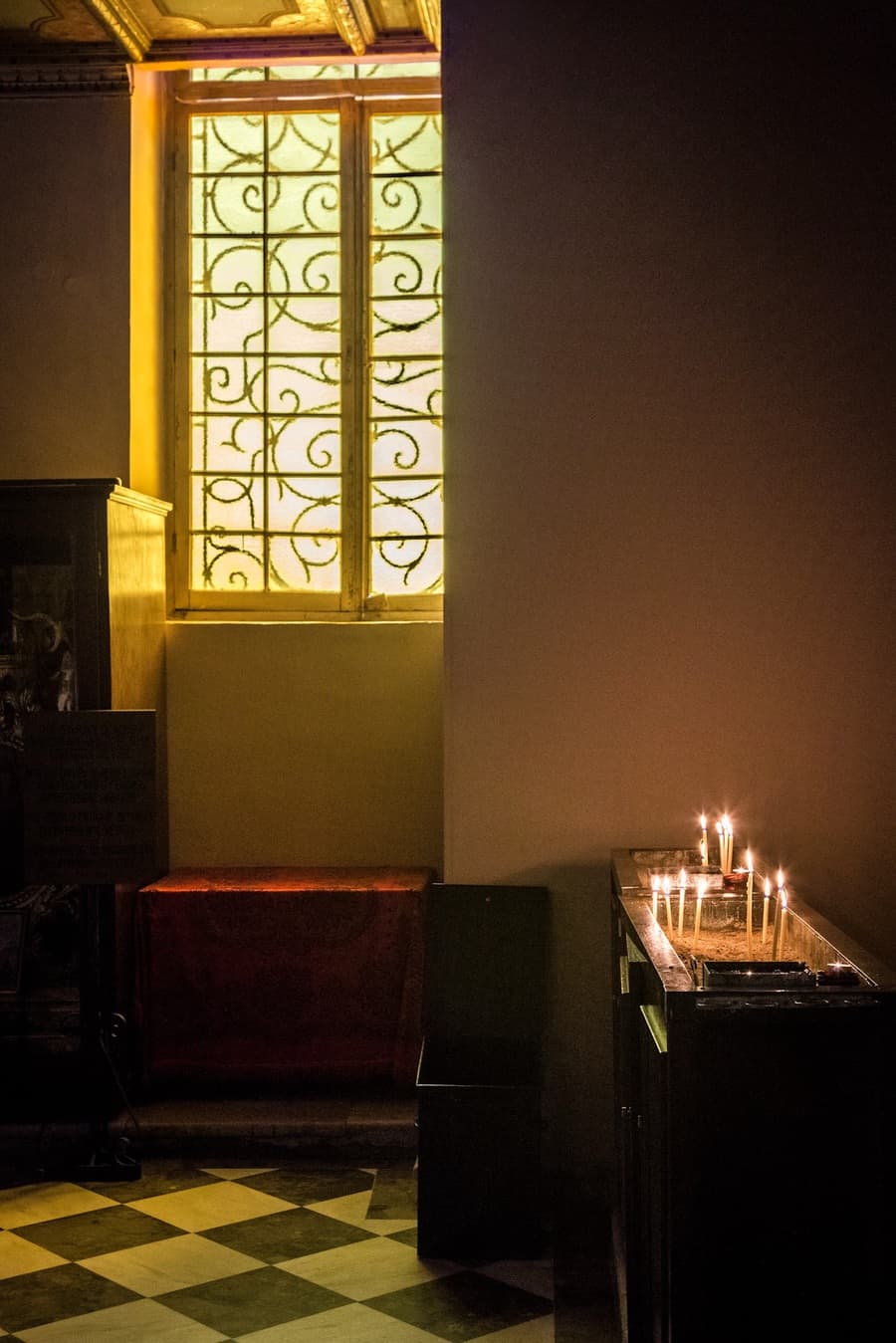
This is an HDR Merge image created using the correctly exposed image (1/30th second) and the two stops underexposed image (1/125th second).
I couldn’t merge the two stop under and two stop over exposed images, as Lightroom could not match them. I have not come across this before, so tried the correct and two stop under exposed images.
And it worked absolutely fine.
Both images were taken using an aperture of F8 with an ISO of 1600. Images captured on my Canon 6D with Canon 24-105mm lens, hand held using the AV Mode.
This images were taken in a church in Corfu this summer. I was drawn to the light streaming in through the window, and the warm glow of the candles. Which is good as I am consciously looking for interesting light now.
This picture was taken at a focal length of 47mm, as I wanted to isolate just this small part of this stunning, atmospheric church. I have excluded a lot of things from this image, getting down to these two elements.
The candles and the window. This is the story.
The HDR Merged image was too bright. I checked this by adding the image to my target collection in Lightroom after creating it, then checking it on the screen of my IPad, after Lightroom Mobile had done its stuff.
To do this I right click on the image, choose “Add to target collection”, and before you know it, there is is. Well I had time to put the kettle on and make a cuppa, but that is the fault of my wi-if and not Adobe.
Adobe get blamed for a lot of speed problems with Lightroom, but not my office wi-if!
White balance
Tricky one. The light sources are the sun streaming in through the window, and the glow (I typed in golf not glow which the spell checker could not handle) of the candles. I always shoot in RAW, so I can sort this after the event.
This is how my correction of the white balance went.
- As Shot – the light was too yellow
- Auto – this cooled the image down
- Daylight – orange
- Cloudy – more orange
- Shade – even more orange
- Tungsten – not that bad to be honest
- Fluorescent – erm no
- Flash – even more no.
I ended up doing a custom white balance, as there was no neutral grey part of the image I could select. I just moved the temperature slider until I got what looked the best for me. Which turned out to be virtually the same as the Auto setting.
Quick Lightroom Tip – it is always worth trying Auto White Balance, and the other presets, even if the the names do not feel like they might make sense to you. You never know – one of these settings might just work fine.
There was one thing that I had to sort – there was a band of blue light at the top of the window, where daylight was coming in above the curtains. Now I know that this was actually there, but the processing exaggerated it, and as it is distracting it needs to be removed. I got rid of the worst of the blue by painting over the band of colour and increasing the temperature all the way to 100. There was still more to do in Photoshop but this was a good start to fixing this problem.
On with the processing. I always start with White Balance.
Contrast
I pushed this a lot, to +76. Sometimes HDR images can lose the contrast in the processing.
Then the rest of the work was done in the basic panel.
I just moved the sliders to get the best look and feel. I won’t bore you with the detail of this, but am happy to tell anyone who wants to know what the slider numbers were.
I darkened the overall image, and added a vignette to draw you into the light.
A couple of other little things I did to this image.
I increased the highlights in the candles by painting with the brush to make the candles even brighter using the highlights slider in the adjustment brush. I also painted clarity onto the window to bring out the patterns in the glass. These little details can make an image.
Noise
A quick word about noise. I don’t do anything with it. There is lots of noise in this image. But does anyone care apart from other photographers?
Of course not. So I just accept it is part of the picture. I really do not worry about it.
Quick trip to Photoshop to fix that window, and we are nearly done here. When I say quick trip I mean I have asked Lightroom to edit the image in Photoshop, then gone to finish off my cuppa, to find it waiting for me!
I cloned out the remaining blue in the window, which went fine. I also cloned out the blue in the wall. And that took a long old time to get absolutely right. I know when an edit has worked when I can’t see what I have done.
Oh yes – I clicked on the black and white option in Lightroom for a quick sneak preview of the inevitable black and white image, which you just know is to follow. Tomorrow I will produce, write about and post the black and white version of this picture.
Rick McEvoy Photography Blog
Tuesday 8th November 2016